Choose Bootstrap when its ready-made components fit your project; choose Tailwind CSS when you want to compose the design with utilities. Both support responsive websites and can be customized. For a new project, compare the component needs, your team’s experience and the build workflow—not popularity alone. This guide covers Bootstrap 5.3 and Tailwind 4, with notes for older Tailwind 3 projects.
Key Takeaways
- Bootstrap is an easy-to-use, beginner-friendly front-end framework that provides pre-built components, making it great for prototyping and quick projects.
- Tailwind CSS offers a more flexible approach, using utility-first classes to allow for unique, custom designs, which requires a bit more time and effort to master.
- Learning Curve: Bootstrap is simpler for beginners to get started with, while Tailwind CSS requires knowledge of modern tools like NPM to fully unlock its potential.
- Customization: Bootstrap 5.3 supports Sass configuration and runtime CSS custom properties. Tailwind 4 uses CSS-first theme variables; Tailwind 3 uses a JavaScript configuration file.
- Choosing between Bootstrap and Tailwind CSS comes down to whether you need a quick solution or desire more creative control.
What is Bootstrap?
Bootstrap is like a ready-made toolkit for building websites. It has pre-designed components like buttons, navigation bars, and forms, which makes it super easy to get started. Imagine you’re putting together a piece of furniture and Bootstrap gives you all the parts and a set of clear instructions—you just have to put it together. It was originally created by developers at Twitter, and its goal is to make web design less complicated by giving us consistent, ready-made building blocks. Bootstrap’s grid system (which helps lay out content on the page) and lots of documentation have made it really popular among beginners and experienced developers alike.
Pros of Bootstrap:
- Pre-built Components: Bootstrap comes with a lot of pre-made parts, like buttons and forms, which means we can quickly put together a website without having to create every element from scratch.
- Grid System: The grid system helps us organize our content easily, especially when it comes to making our site look good on different screen sizes, like tablets and phones.
- Consistency: Bootstrap helps us make sure our website looks the same across different browsers and devices, saving us time and headaches.
- Powerful SCSS setup – Bootstrap uses SCSS to compile code into CSS and with this it provides a number of powerful mixins and functions you can use in your own code such colour shades, media query creation and more. The SCSS is also very customisable using SCSS variables to alter almost anything you like include font size, primary colours and more.
In addition, the modular SCSS setup means you can pick and choose whether you want to use all of Bootstrap or just for example the grid system. - It includes Javascript functionality: for some looking for an unopinionated CSS framework this could be considered a con but Bootstrap does come with core Javascript components like dropdowns, collapse, modals and more which can be a nice addition and are optional.
Cons of Bootstrap:
- Opinionated Styling: Because Bootstrap gives us a lot of pre-designed styles, many Bootstrap websites can look similar unless we customize them.
- Bloat: Since Bootstrap comes with a lot of components, it can be a bit heavy if we only end up using a small portion of what’s included. You can get around this uses build tools like purgeCSS as we do in our AppStrap Bootstrap theme but it’s not built in by default to Bootstrap core.
Example Code:
Here’s a simple example of how we can use Bootstrap to create a layout with two columns and a button:
<div class="container">
  <div class="row">
    <div class="col-md-6">
      <h2>Welcome to Bootstrap</h2>
      <p>This is a simple example of using Bootstrap's grid system.</p>
    </div>
    <div class="col-md-6">
      <button class="btn btn-primary">Click Me</button>
    </div>
  </div>
</div>
Looking for a Bootstrap theme?
What is TailwindCSS?
TailwindCSS is a bit different from Bootstrap. Instead of giving us ready-made components, Tailwind provides a set of smaller, reusable classes that we can use to build our own components from scratch. It’s like getting all the parts of a Lego set but without instructions—we can build whatever we want, however we want. This means we have a lot of control over our design, but we also have to do a bit more work.
Pros of Tailwind CSS:
- Flexibility & very customisable: With Tailwind, you get a toolkit overflowing with almost anything you can think of and full control over how our website looks, which means we can make something truly unique. Tailwind 4 uses CSS-first configuration with
@theme. Older Tailwind 3 projects usetailwind.config.js. - Utility-First: Tailwind lets us style everything by adding small, specific classes directly to our HTML. This means we don’t need to write a lot of custom CSS code.
- Smaller Bundle Size: We only include the classes we actually use, which means our CSS files can be much smaller compared to something like Bootstrap. This is done by providing Tailwind with your “content” ie. where you CSS classes are added like your .html files, JSX files or similar, it reads which classes are used and only includes those classes in the production bundles.
- Super useful Pseudo-classes & Pseudo-elements allowing you to set hover, focus, first-child and even :before & :after without needing to write any CSS code! Examples:
bg-slate-500 hover:bg-slate-700 - Simple and sane dark mode: prefixing classes with
dark:means they’ll be triggered when dark mode is active and you can determine when dark mode is active based on the operating system or a HTML selector. Exampe:bg-white dark:bg-slate-800
Cons of Tailwind CSS:
- Learning Curve: For beginners, Tailwind can be confusing at first. It works differently from what many of us are used to and to get all the customisation options relies on knowledge of build tools, so there can be a bit of a learning curve. To get the most out of Tailwind, we also need to use tools like NPM (Node Package Manager) to install and configure it effectively, which can be intimidating for those unfamiliar with modern web development workflows.
- HTML Clutter: Because we add a lot of classes directly to our HTML, the code can look cluttered and be harder to read.
- Trickier when working with a CMS content: As mentioned above, Tailwind scans your “content” for the classes you actually use which as we said gives a smaller bundle but this can get tricky when your content is coming from a CMS like Drupal or WordPress when you use classes in your content and Tailwind doesn’t know about them. You can get around this by uses templates or patterns or even provide Tailwind with a dynamic “safelist” of classes direct from your CMS (we’ll cover how we’ve solved this in WordPress in a future post!).
- No core Javascript functionality – unlike Bootstrap TailwindCSS as the name suggests is just about CSS and includes no Javascript functionality by default. From a beginner perspective this is probably a con but for more advanced users it’s probably a pro and this is probably a factor as to why Tailwind has become so popular to use along side Javascript frameworks like React, NextJS and the like: you just get a clean CSS framework and no Javascript you need to work around.
Example Code:
Here’s an example of a simple layout using Tailwind CSS:
<div class="flex items-center justify-center h-screen bg-gray-100">
  <div class="bg-white p-6 rounded-lg shadow-lg">
    <h2 class="text-2xl font-bold mb-2">Welcome to Tailwind CSS</h2>
    <p class="text-gray-700">This is a simple example of using Tailwind's utility classes.</p>
    <button class="mt-4 bg-blue-500 text-white px-4 py-2 rounded">Click Me</button>
  </div>
</div>
Bootstrap vs Tailwind CSS: Card Component Comparison
To help illustrate the differences between Bootstrap and Tailwind CSS, let’s look at how we would create a simple card component in each framework.
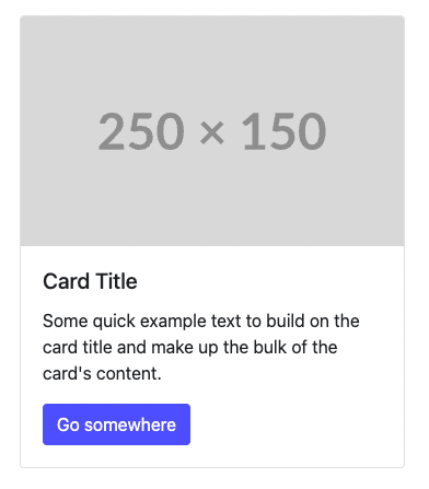
Bootstrap Card Example:
<div class="card" style="width: 18rem;">
  <img src="https://via.placeholder.com/150" class="card-img-top" alt="Card Image">
  <div class="card-body">
    <h5 class="card-title">Card Title</h5>
    <p class="card-text">Some quick example text to build on the card title and make up the bulk of the card's content.</p>
    <a href="#" class="btn btn-primary">Go somewhere</a>
  </div>
</div>
In Bootstrap, we can create a card component using the card class along with other helper classes like card-body, card-title, and btn. This gives us a complete, styled card out of the box.
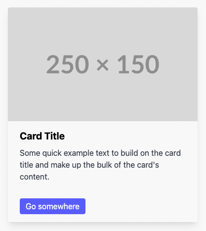
Tailwind CSS Card Example:
<div class="max-w-sm rounded overflow-hidden shadow-lg">
  <img class="w-full" src="https://via.placeholder.com/150" alt="Card Image">
  <div class="px-6 py-4">
    <div class="font-bold text-xl mb-2">Card Title</div>
    <p class="text-gray-700 text-base">
      Some quick example text to build on the card title and make up the bulk of the card's content.
    </p>
  </div>
  <div class="px-6 pt-4 pb-2">
    <a href="#" class="inline-block bg-blue-500 text-white px-3 py-1 rounded">Go somewhere</a>
  </div>
</div>
In Tailwind CSS, we have more control over the individual pieces of the card. We use utility classes like max-w-sm, shadow-lg, px-6, and text-gray-700 to create the card from scratch. This gives us flexibility in deciding how each part of the card should look and behave.
The results are very similar but note the different between Bootstraps card specific classes and Tailwinds utility classes, some will love or hate both approaches!
One thing to note & one of the powerful features of Tailwind CSS is the ability to use the @apply directive to reuse utility classes in a separate CSS file. This allows us to keep our HTML cleaner and make our styling more maintainable if you like Bootstrap component specific classes but prefer to use Tailwind.
Here is an example of the Tailwind card example using @apply to create reusable .card classes.
CSS:
/* styles.css */
.card {
  @apply max-w-sm rounded overflow-hidden shadow-lg;
}
.card-img {
  @apply w-full;
}
.card-body {
  @apply px-6 py-4;
}
.card-title {
  @apply font-bold text-xl mb-2;
}
.card-text {
  @apply text-gray-700 text-base;
}
.card-link {
  @apply inline-block bg-blue-500 text-white px-3 py-1 rounded;
}
HTML:
<div class="card">
  <img class="card-img" src="https://via.placeholder.com/150" alt="Card Image">
  <div class="card-body">
    <div class="card-title">Card Title</div>
    <p class="card-text">
      Some quick example text to build on the card title and make up the bulk of the card's content.
    </p>
  </div>
  <div class="px-6 pt-4 pb-2">
    <a href="#" class="card-link">Go somewhere</a>
  </div>
</div>
So in theory if you go that extra step you can have the best of both worlds with Tailwind or as we sometimes do, use the utility classes as standard and then for styling/components we reuse often we’ll make component specific classes exactly like in the example above. A number of TailwindCSS UI kit like DaisyUI use this approach as well.
Design Philosophy: Differences & Similarities
Design Philosophy
- Bootstrap: Bootstrap is built around providing a complete toolkit with pre-styled components and a strong grid system. It’s aimed at helping us get up and running quickly, which makes it ideal for prototyping or projects where consistency is crucial.
- Tailwind CSS: Tailwind takes a different approach by giving us a lot of small, flexible utility classes. This lets us craft our designs piece by piece, resulting in more customised and unique outcomes. Tailwind is a great choice if we want to create something that doesn’t look like every other Bootstrap site.
Customization
- Bootstrap: Bootstrap is customisable through Sass variables, which allows us to change colours, fonts, and other settings. However, this requires a basic understanding of Sass and Bootstrap’s theming system. For those just starting out, it can be challenging but rewarding once mastered. Bootstrap 5.3 also exposes root and component CSS custom properties for runtime customization. See the Bootstrap CSS variables documentation.
- Tailwind CSS: Tailwind is highly customisable right out of the box. In Tailwind 4,
@themedefines design tokens in CSS. Tailwind 3 usestheme.extendin its JavaScript configuration. See the Tailwind theme variables documentation.
Learning Curve
- Bootstrap: Bootstrap is generally easier for beginners to pick up because of its ready-made components and consistent documentation. We can quickly start building without needing to worry about much configuration.
- Tailwind CSS: Tailwind has a steeper learning curve because it requires understanding how to effectively apply utility classes. To get the full power of Tailwind, we also need to use tools like NPM, which involves setting up a modern development environment. This might feel daunting at first, but once we’re comfortable, it opens up a lot of possibilities for efficient and customised design.
Which One Should We Choose?
If we’re beginners, Bootstrap might be the best place to start. It gives us everything we need right out of the box, and we can create a good-looking website without much effort. It’s also great for prototyping or for when we need something up and running quickly, like for a client project.
Tailwind CSS, on the other hand, is a better fit if we want more creative control over our design. Tailwind allows us to create a unique look and feel, but it might take a little longer to get comfortable with it, especially if we’re new to web design. It’s ideal for freelancers who want to make their websites stand out and need a more customised approach.
We love both frameworks but it’s important to consider they both fit different needs and projects so there isn’t really a one-size fits all approach to these two.
Usage Comparison
To understand how popular these frameworks are, we can look at a couple of key metrics:
- GitHub stars indicate interest in a repository, not the number of production websites. Check the repositories for current counts rather than choosing a framework from a historical total.
- Package downloads include automated builds and repeat installs. They do not measure unique developers or prove which framework is best for your project.
The Bottom Line
Both Bootstrap and Tailwind CSS are powerful tools for building websites both small and large, but they have different strengths. Bootstrap is great if we want something that works out of the box and saves time, especially if we’re just starting out. Tailwind CSS is perfect if we want more creative freedom and are ready to spend a bit more time learning how to use and customise it effectively.
If we’re beginners, it’s okay to start with Bootstrap and get comfortable with building websites before moving on to something more flexible like Tailwind. If we’re freelancers looking for ways to make our work more efficient while delivering unique designs, Tailwind could be the right fit.
In short, knowledge of both can be beneficial to any beginner or developer so which ever one you pick it’s unlikely you’ll regret it.
Frequently Asked Questions (FAQs)
Which is better Bootstrap or Tailwind CSS?
It depends on what you’re looking for. If you want something that’s easy to use and provides a lot of pre-built components, Bootstrap might be better for you. If you want more flexibility and control over your design, Tailwind CSS could be the better option.
Should I learn Bootstrap or Tailwind first?
If you’re just starting out, learning Bootstrap can be a good way to understand basic front-end development quickly. Tailwind CSS, however, is gaining popularity and offers more customization options, so it might be worth exploring once you’re comfortable with the basics.
Is it better to use Tailwind or CSS?
Tailwind CSS is a framework that uses utility classes to style HTML, which can be more efficient for many developers. If you prefer writing custom styles from scratch and want full control, you might stick with plain CSS. Tailwind helps speed up the development process with pre-defined classes.
Is it OK to use Bootstrap and Tailwind together?
While it’s technically possible to use Bootstrap and Tailwind together, it’s not recommended because they serve similar purposes and can lead to conflicts. It might make your code more complicated and harder to maintain. It’s generally better to choose one framework and stick with it for a project.
Can I switch from Bootstrap to Tailwind CSS?
Yes, it is possible to switch from Bootstrap to Tailwind CSS. However, it requires refactoring the existing codebase to replace Bootstrap’s pre-built components and styles with Tailwind’s utility classes. This might be a good option if you want more design flexibility or if you are aiming for a more unique style for your website.
Which framework is better for mobile responsiveness?
Both Bootstrap and Tailwind CSS provide strong tools for creating mobile-responsive websites. Bootstrap uses its grid system and responsive utilities, while Tailwind offers utility classes like flex, grid, and responsive prefixes to control the design on different screen sizes. Choosing between them depends on your preference—Bootstrap’s grid is more conventional, while Tailwind’s approach gives you greater control over individual elements.
Agentic coding for web design: Bootstrap or Tailwind?
In an agentic coding workflow, an AI coding agent can work through a task across several steps: inspect the project, propose changes, edit files and run checks with the tools you allow it to use. For web design, we can make that task concrete by starting with an existing template and a small visual change. You still define the brief and review the result.
With Bootstrap, ask the agent to reuse the project’s components, grid and utilities. This gives it an existing structure for forms, navigation and interactive elements. With Tailwind, ask it to follow the project’s spacing, colour and typography conventions, and use complete utility class names. Neither framework guarantees good output: clear constraints and a working preview matter more than a broad instruction to “make it look better”.
Example: Give the agent a focused component task
Here is a sample prompt for an existing Bootstrap project. It keeps the change small enough to inspect and gives the agent observable checks to complete:
Read the project instructions and identify the installed Bootstrap version.
Find the existing FAQ section and its project-owned stylesheet.
Change its accordion arrows to plus/minus icons.
Reuse Bootstrap's collapse behaviour and aria-expanded state.
Preserve the questions, links, visible focus styles and existing layout.
Do not add dependencies or modify vendor files.
Check open and closed states with a mouse and keyboard.
Review the page at 390px and 1440px widths for overflow.
Show the changed files, checks performed and any unresolved issues.
Compare the result with our Bootstrap accordion plus/minus tutorial. For Tailwind, use the same approach to build a card with group-hover and keyboard focus states. Ask the agent to use the installed Tailwind version and preserve the card’s destination and accessible name.
Review the design as well as the code
Before accepting a change, compare it with your brief in the browser. Check mobile layout, long text, contrast, keyboard navigation and interaction states. Read the diff for unexpected dependencies or unrelated edits. A successful build is useful evidence, but it does not tell you whether the page communicates clearly or feels right to use.
Keep each task focused and save a known working version before moving on. That makes it easier to spot regressions and gives the next agent task a clear starting point. Our HTML templates provide frontend starting points for this process; the agent, its permissions and your application backend are separate choices.
Try a template before choosing
Compare an AppStrap Bootstrap website and admin theme with DevSikt Free, an HTML-first Tailwind admin starter. Run the build, change a component and test the navigation at a narrow width. Choose the workflow you can maintain. For a small Tailwind exercise, try our version-specific gradient examples.