We recently released a major update to our longstanding AppStrap Bootstrap theme, which now includes an admin UI in addition to the standard frontend UI. As part of this admin UI, we wanted to integrate some form of charting or graph displays that are easy to implement using basic HTML markup. In this post, we’ll show you how we achieved this using the awesome ApexCharts plugin, enabling you to add charts and graphs to your projects without needing any heavy JavaScript coding.
What is ApexCharts?
ApexCharts is a modern charting library that lets you create interactive, feature-rich charts with just a few lines of code. Whether you’re working with line charts, bar graphs, or pie charts, ApexCharts is designed to be developer-friendly, fully responsive, and highly customizable. It provides a range of chart types and features that make data visualization straightforward, even for those new to JavaScript.
Why Use ApexCharts?
- Multiple Chart Types: ApexCharts offers a wide variety of chart types, including bar, line, area, scatter, and pie charts, making it flexible for different types of data visualization needs.
- Built for Developers: It integrates well with popular frontend frameworks such as React, Vue, and, of course, Bootstrap, making it an excellent choice for developers.
- Fully Responsive: All charts are designed to be responsive by default, making them ideal for dashboards that need to look good on both desktops and mobile devices.
- Customizable: You can tweak nearly every aspect of your charts, from colors and labels to more advanced options like animations and tooltips.
- Free and Open Source: The core of ApexCharts is open-source, making it accessible and customizable for personal or commercial use.
Integrating ApexCharts into Bootstrap (or any HTML based project)
To integrate ApexCharts into your Bootstrap project, follow these steps. Our AppStrap Bootstrap theme uses a unique approach to optimize script loading and performance, including on-demand script loading, which makes integration even more efficient.
Step 1: Add the CDN JavaScript to Your Page
To start using ApexCharts, you’ll need to add the library to your HTML page. You can do this by including the following script:
<script src="https://cdn.jsdelivr.net/npm/apexcharts"></script>AppStrap makes use of on-demand script loading to improve page performance. By using a method like this, you can load scripts when they are needed rather than including them in the initial page load.
Step 2: Custom JavaScript to Find & Render ApexCharts HTML Markup
JavaScript Initialisation Code:
This code will scan our HTML markup for the presents of any data-apexcharts elements and then initialise ApexCharts with the options passed from data-options in the HTML on that same element.
var apexChartsElements = document.querySelectorAll("[data-apexcharts]");

if (apexChartsElements.length > 0) {
  var initializeApexCharts = function () {
    apexChartsElements.forEach(function (element) {
      // Get JSON from data-options attribute
      var chartOptions = JSON.parse(element.getAttribute("data-options"));

      // Create the chart
      var chart = new ApexCharts(element, chartOptions);

      // Render the chart and trigger resize after it is loaded
      chart.render().then(function () {
        window.dispatchEvent(new Event("resize"));
      });
    });
  };
  initializeApexCharts();
}
Explanation:
document.querySelectorAll("[data-apexcharts]")selects all elements with the attributedata-apexcharts.- We iterate over each element and extract the chart options stored in the
data-optionsattribute. - We then create a new instance of
ApexChartswith these options and render it. - Finally, the
resizeevent ensures that the charts are properly sized when rendered.
Step 3: Turning HTML Markup into Charts and Graphs
We wanted to enhance the power of ApexCharts and make it simple to implement with basic HTML markup at a page level, combined with JavaScript to handle the rendering. Let’s look at some examples of how to turn this into an interactive experience.
Example 1: Bar Chart
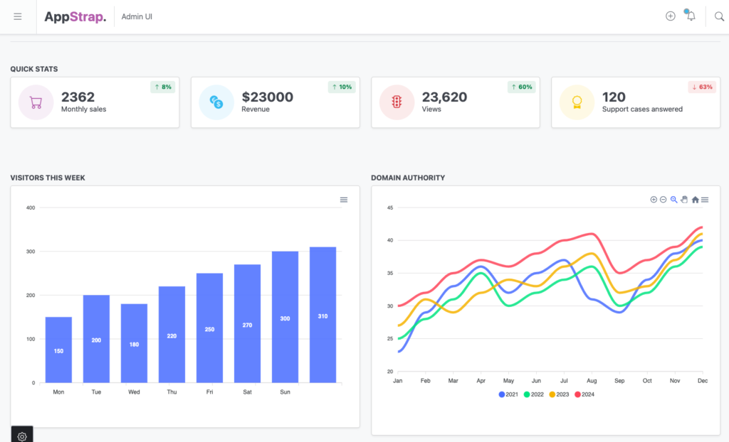
<div data-apexcharts data-options='{"chart": {"type": "bar"}, "series": [{"name": "Visitors", "data": [150, 200, 180, 220, 250, 270, 300, 310]}], "xaxis": {"categories": ["Mon", "Tue", "Wed", "Thu", "Fri", "Sat", "Sun"]}}'></div>This example defines a basic bar chart with visitor data for each day of the week. By adding data-options to the div element, we can specify the chart type, series data, and x-axis categories.
Example 2: Multi-Line Chart
<div data-apexcharts data-options='{
  "chart": {
    "type": "line"
  },
  "series": [{
    "name": "2021",
    "data": [23, 29, 33, 36, 32, 35, 37, 31, 29, 34, 38, 40]
  }, {
    "name": "2022",
    "data": [25, 28, 31, 35, 30, 32, 34, 36, 30, 32, 36, 39]
  }, {
    "name": "2023",
    "data": [27, 31, 29, 32, 34, 33, 36, 38, 32, 33, 37, 41]
  }, {
    "name": "2024",
    "data": [30, 32, 35, 37, 36, 38, 40, 41, 35, 37, 39, 42]
  }],
  "xaxis": {
    "categories": ["Jan", "Feb", "Mar", "Apr", "May", "Jun", "Jul", "Aug", "Sep", "Oct", "Nov", "Dec"]
  },
  "stroke": {
    "curve": "smooth"
  },
  "legend": {
    "show": true,
    "onItemClick": {
      "toggleSeries": true
    }
  },
  "tooltip": {
    "enabled": true
  }
}'></div>
This multi-line chart example shows trends across multiple years, allowing users to visualize comparisons effectively. It demonstrates features like tooltips, legends, and smooth stroke curves for a polished presentation.
You can see these 2 examples live in the AppStrap Admin UI homepage:

Extended Example Using an External Live API
Now those basic examples are great for testing ApexCharts but in real life static data isn’t that useful so let’s extend things and pull some live data direct from https://dummyjson.com/ and plot in on a graph. To do this we need to add some more options to our Javascript code, keeping things generic so we can implement as many charts in this manner as we like without needing to change our Javascript initialisation code at all!
Extending our original Javascript initialisation code
We’re going to add support for 2 new attributes on our data-apexcharts elements: data-fetch-url and data-options-callback to allow us to first fetch data from the defined data-fetch-url and then alter the data-options to define how the data should be use on the series & xaxis values, to do the latter we’ll provide an inline Javascript callback below our HTML code, pass the function name as data-options-callback and have the initialisation code call it to update the options before rendering the chart.
var apexChartsElements = document.querySelectorAll("[data-apexcharts]");

if (apexChartsElements.length > 0) {
  apexChartsElements.forEach(function (element) {
    var dataFetchUrl = element.getAttribute("data-fetch-url");
    var dataOptionsCallback = element.getAttribute("data-options-callback");
    var chartOptions = JSON.parse(element.getAttribute("data-options"));

    if (dataFetchUrl) {
      // Fetch data from the provided URL
      fetch(dataFetchUrl)
        .then(response => {
          if (!response.ok) {
            throw new Error('Network response was not ok');
          }
          return response.json();
        })
        .then(data => {
          // If a callback function is provided, use it to modify chart options
          if (dataOptionsCallback && typeof window[dataOptionsCallback] === 'function') {
            chartOptions = window[dataOptionsCallback](data, chartOptions);
          }

          // Create and render the chart
          var chart = new ApexCharts(element, chartOptions);
          chart.render().then(function () {
            window.dispatchEvent(new Event("resize"));
          });
        })
        .catch(error => {
          console.error('There was a problem fetching the data:', error);
        });
    } else {
      // Create the chart without fetching data
      var chart = new ApexCharts(element, chartOptions);
      chart.render().then(function () {
        window.dispatchEvent(new Event("resize"));
      });
    }
  });
}
This updated initialization code adds support for the two new attributes: data-fetch-url and data-options-callback. The data-fetch-url attribute allows you to provide a URL from which the chart data will be fetched. The data-options-callback attribute specifies the name of a callback function that will modify the chart options based on the fetched data before rendering the chart.
Extend our HTML Markup
Now let’s implement the HTML & inline JavaScript to use these 2 new options:
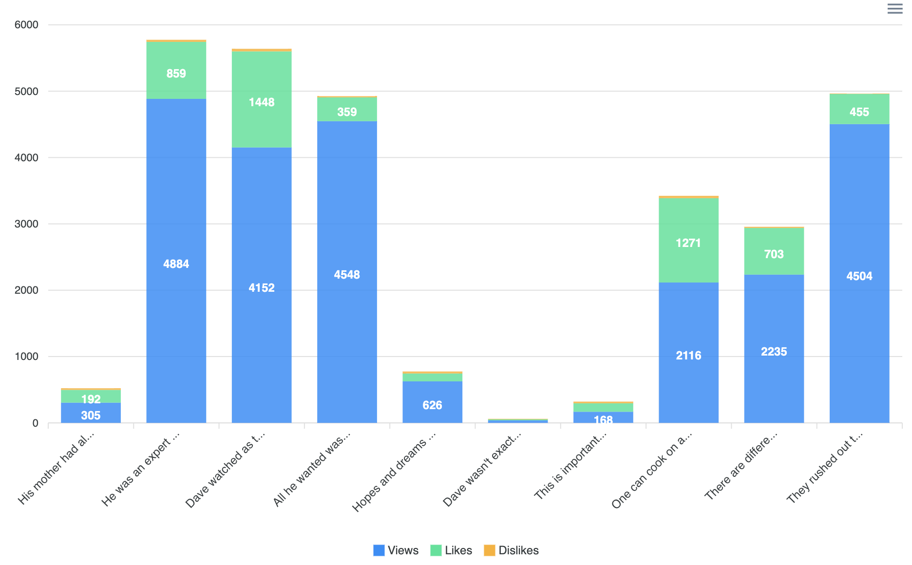
<div data-apexcharts data-fetch-url="https://dummyjson.com/posts?limit=10" data-options-callback="customChartCallback" data-options='{"chart": {"type": "bar"}, "series": [], "xaxis": {"categories": []}}'></div>

<script>
  function customChartCallback(data, options) {
    // Override chart options with fetched data
    if (data && data.posts) {
      options.series = [
        {
          name: 'Views',
          data: data.posts.map(post => post.views)
        },
        {
          name: 'Likes',
          data: data.posts.map(post => post.reactions.likes)
        },
        {
          name: 'Dislikes',
          data: data.posts.map(post => post.reactions.dislikes)
        }
      ];
      options.xaxis.categories = data.posts.map(post => post.title.substring(0, 17) + "...");
    }
    return options;
  }
</script>
Now when the HTML is found in the page the Javascript initialisation code will doing the following:
- Call the
data-fetch-urlURL and wait for a response - On success, it will call the
data-options-callbackcallback function which is passed the data from the response and the initial ApexCharts options passed from ourdata-apexchartselement. From there we update the series and xaxis based on the data we recieved.
The result looks like this (views, likes, dislikes data from https://dummyjson.com/posts plotted onto an ApexCharts bar graph):

This approach keeps your charts dynamic and suitable for dashboards where data is updated frequently but most importantly keeps the implementation generic and easier to use than having to initiate each chart or graph you have via pure Javascript. This is the approach we take with Javascript when building web themes and templates.
Conclusion
Integrating ApexCharts with Bootstrap is a great way to enhance the visual appeal and usability of your admin dashboards. Whether you’re using simple data attributes or fetching data from an external source, ApexCharts makes it easy to add interactive charts to your project with minimal coding effort. Our AppStrap theme is designed to make incorporating these charts even smoother, leveraging techniques like on-demand script loading to keep performance at its best.
If you’re interested in exploring more or want a complete solution that already integrates these charts seamlessly, check out our AppStrap Bootstrap theme: AppStrap Bootstrap 5 HTML Multipurpose Admin Theme.
We hope this guide helps you get started with ApexCharts and inspires you to add rich visualizations to your next project. Feel free to leave a comment or get in touch if you have questions or want to share your experience!


